Acorn Overseas is a charity that supports underprivileged children abroad.
This non-profit needed a clean and professional logo to assist them in donations and sponsorship development.
solution:
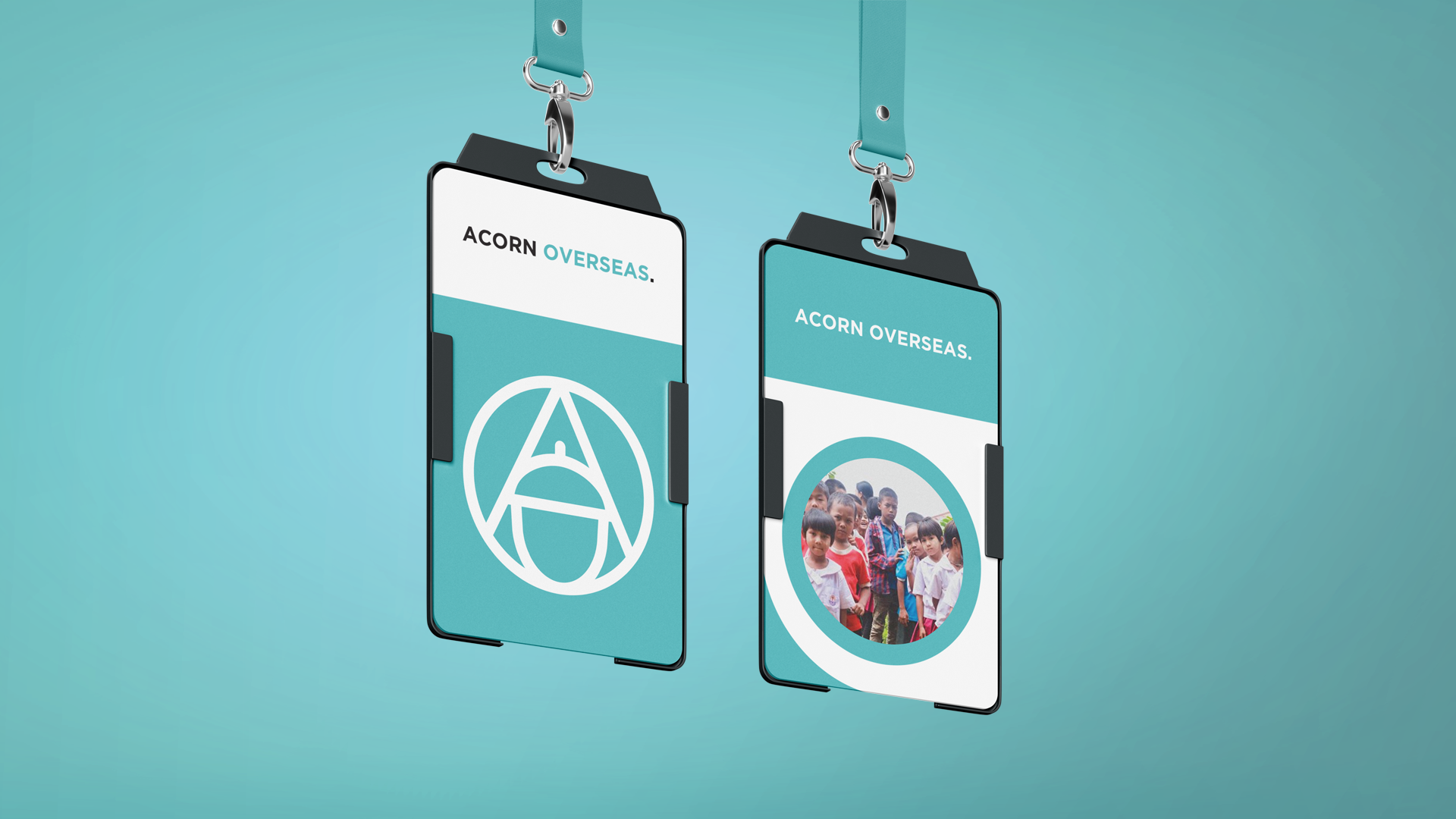
While designing this concept for Acorn Overseas we began by defining the elements that make up the brand. From this, we created a simple icon to go alongside clean bold text.
SERVICES: Branding // Logo Design
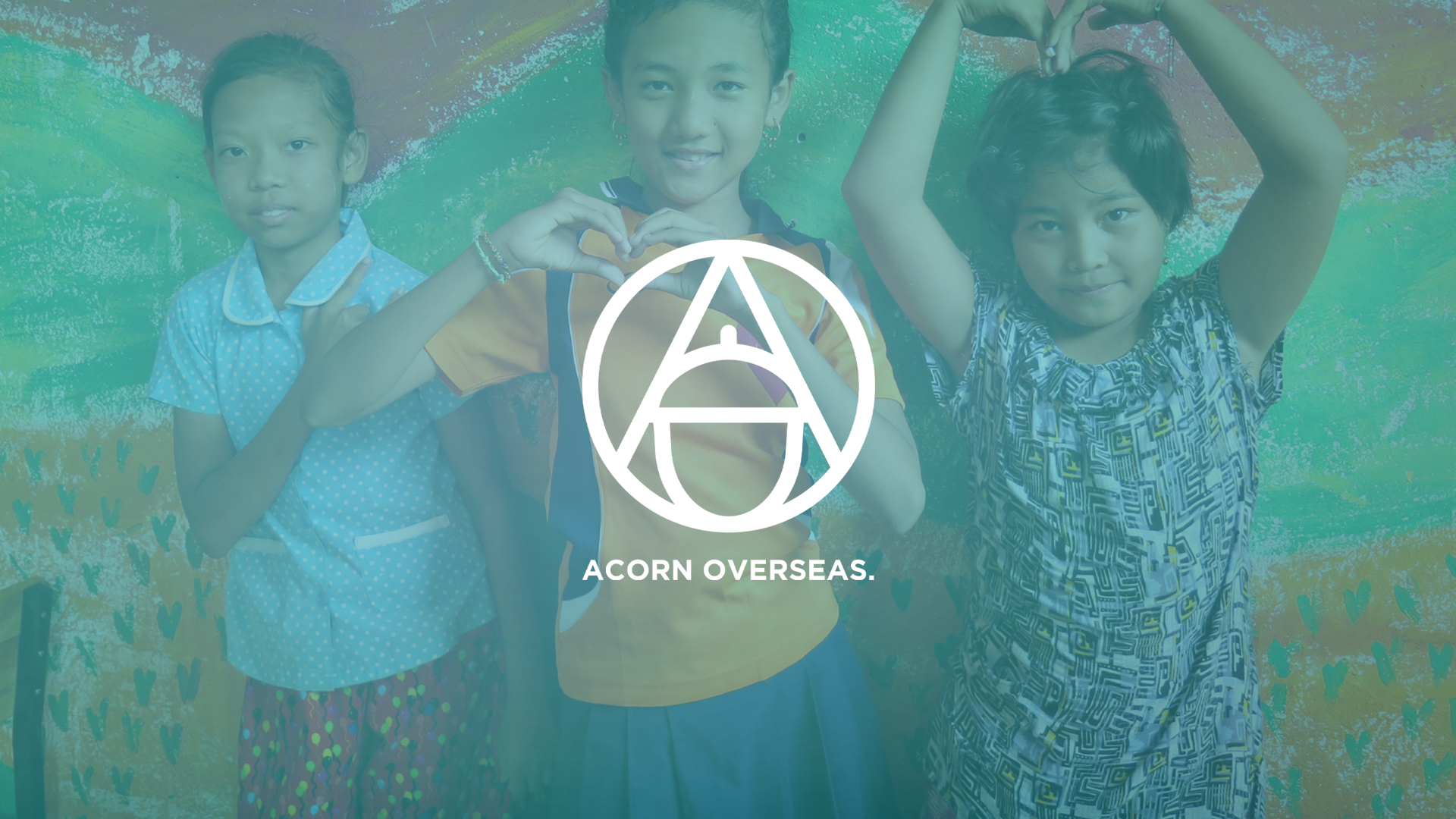
Symbolism
Using symbolism in this logo ensured the company’s values were demonstrated throughout the design.
The A represents the company and the work that goes into creating better futures for children. The negative space also creates an upward-facing arrow that represents the continued struggle to create a better world.
The O represents the globe and the fact that we are all children of this earth.
The acorn represents the children overseas and the potential that they have to grow into oak trees if given the appropriate resources.
We have created something that can stand amongst any successful NFP, while still representing the wholesome values of Acorn Overseas.