Florists in the UK often lean on vintage serif fonts and this can lead to a sea of similar brands on the British high street.
‘Blossom Parlour’ approached us and requested a simple and clean brand mark that would look great on all touch points, both physical and digital.
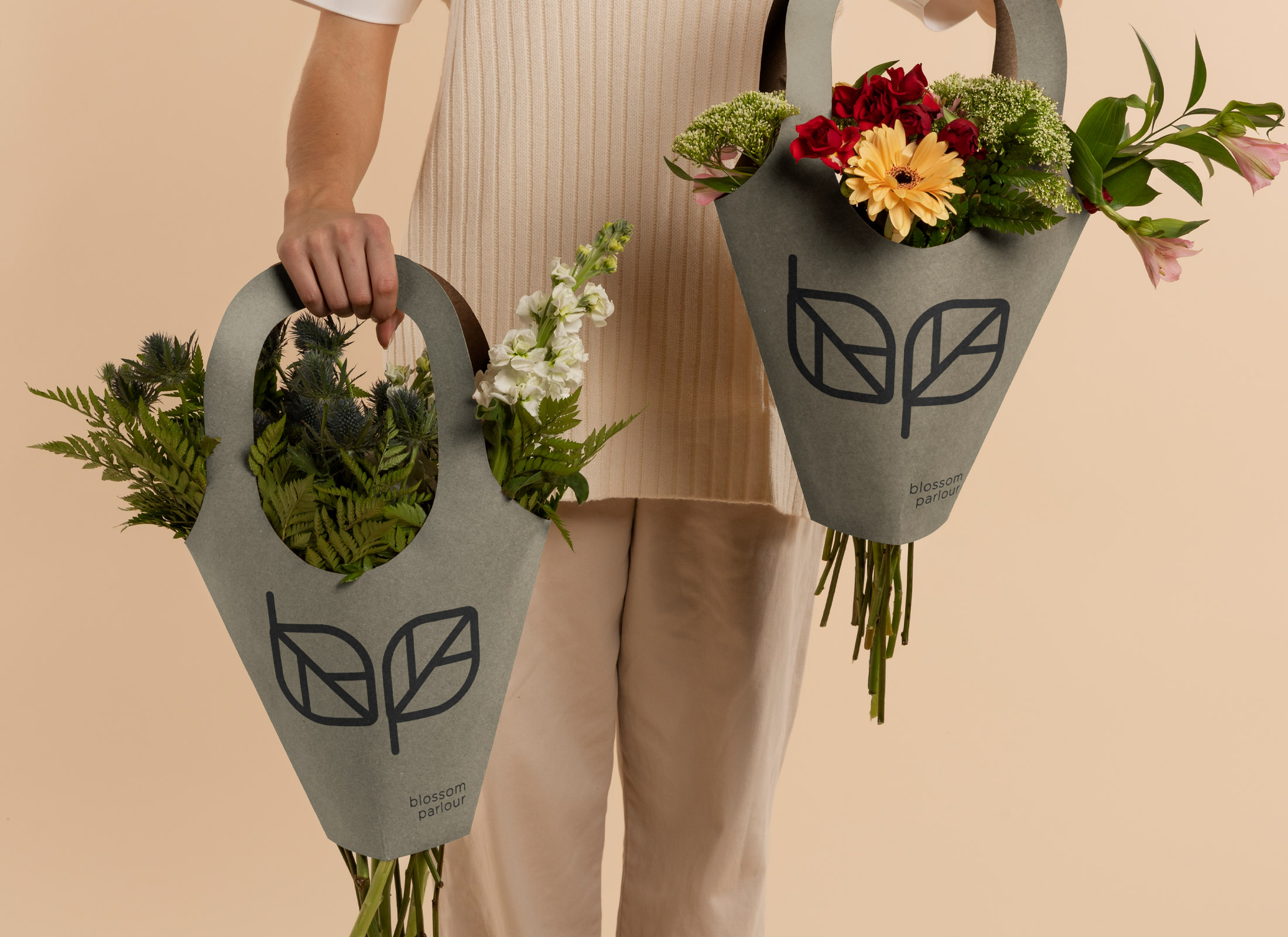
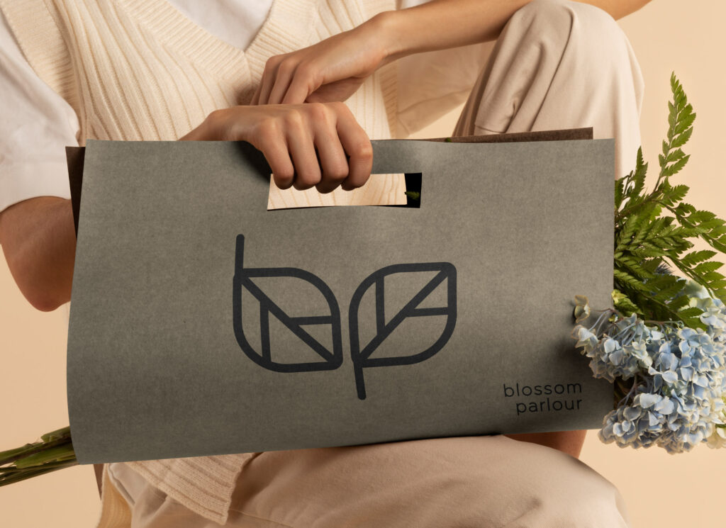
It was important to highlight fresh green spring vibes throughout the brand as Blossom Parlour focus primarily on the use of greenery in their bouquets.
solution:
Creating something simple is often harder than over-embellishing or leaning on the norms of the industry.
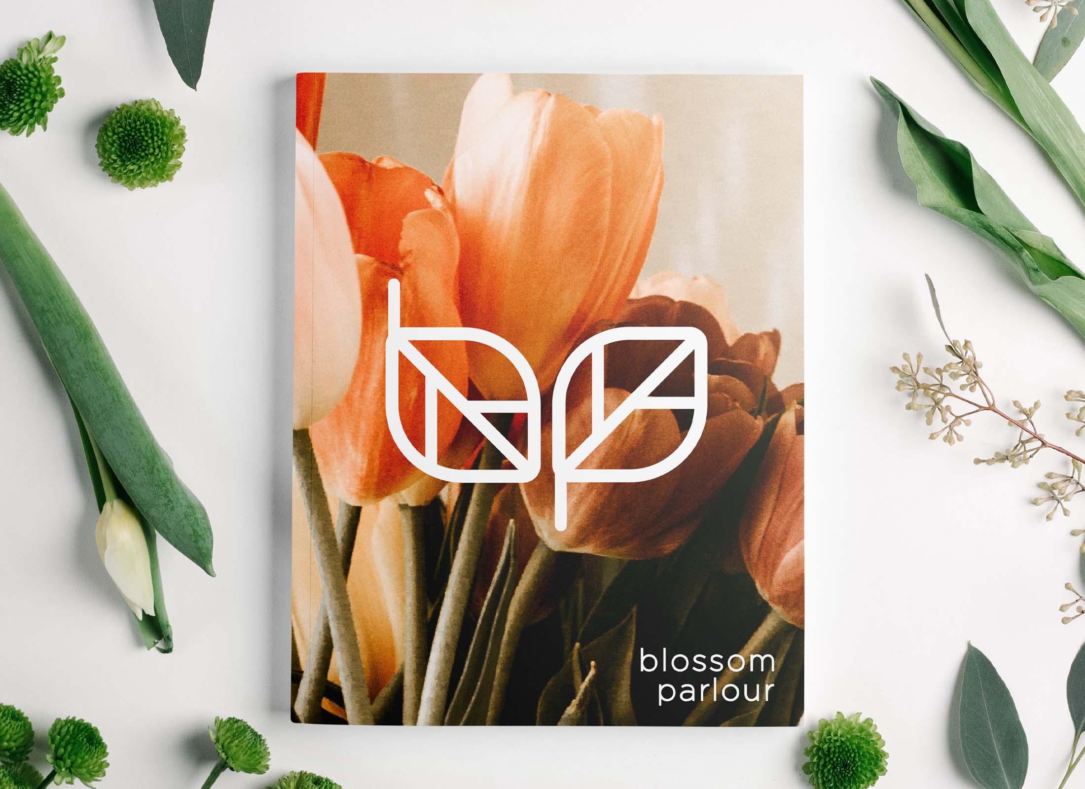
Amy was keen to explore a simple and bold brand mark that would be instantly recognizable. Focusing on the greenery that Blossom Parlour is known, for we used a leaf rotated at opposing angles to represent the b and p.
SERVICES: Brand Strategy // Branding // Logo Design
ASSETS: Logo // Branding
Neutral Tones
We used a neutral color palette as not to steal any attention away from the product. The brand itself enhances the flowers and sits nicely beside all colors in a bouquet.
I love our new logo, we really stand out from the other florists.