Boston Bay Marina is referred to as Boston Harbor’s best-kept secret. After years of success, Boston Harbor Marina deserves a new look.
Retaining the established color palette and using nautical influences is key in the new design.
solution:
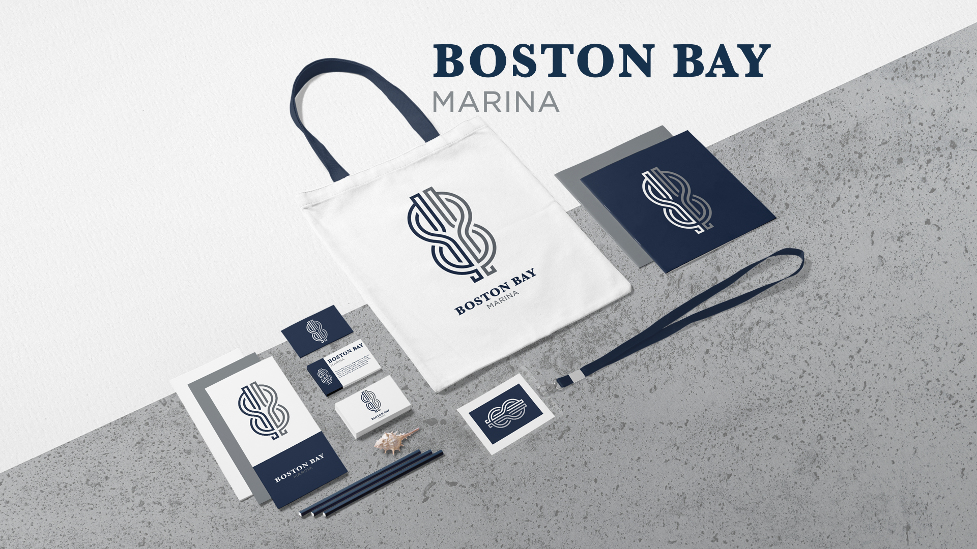
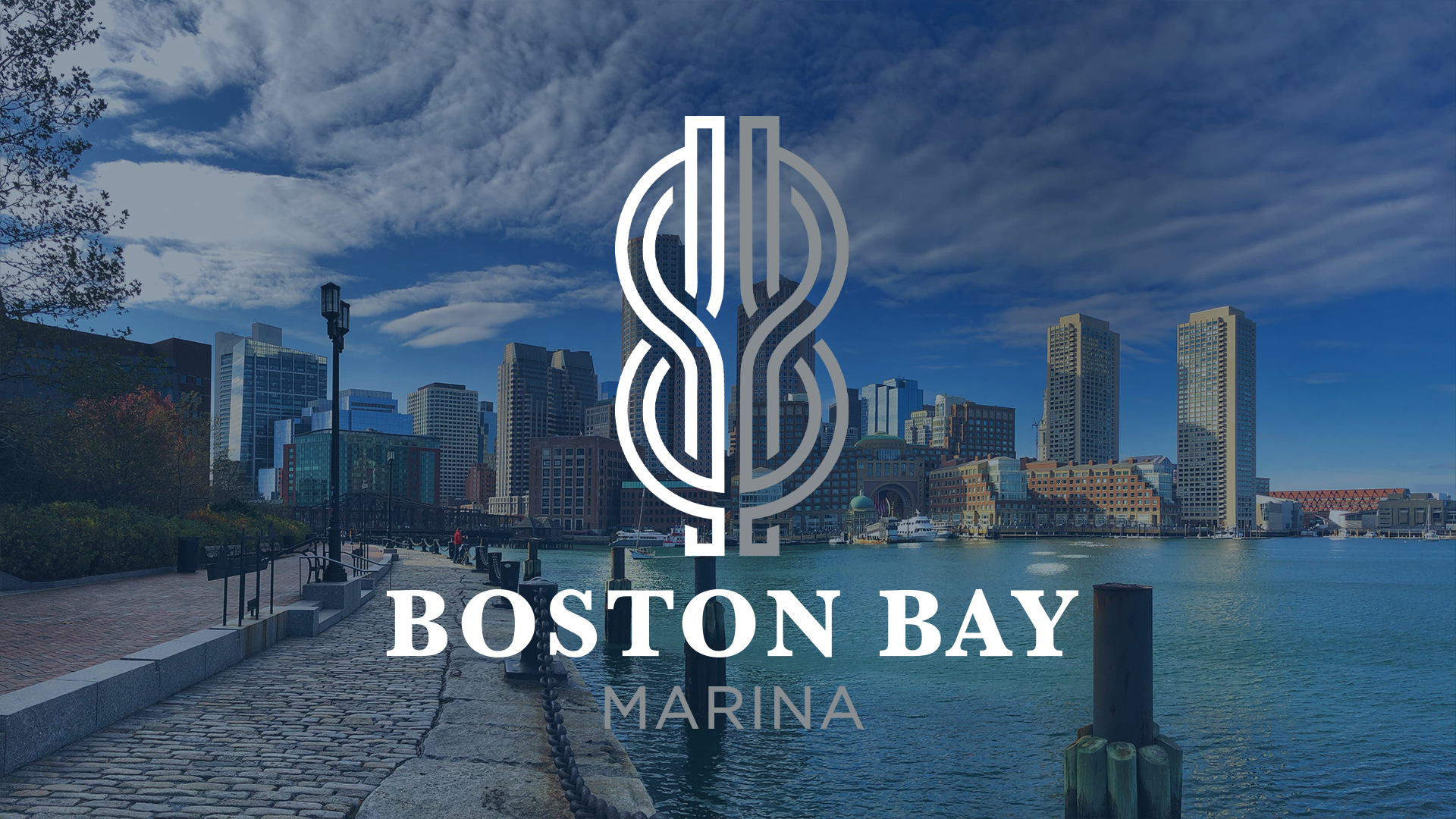
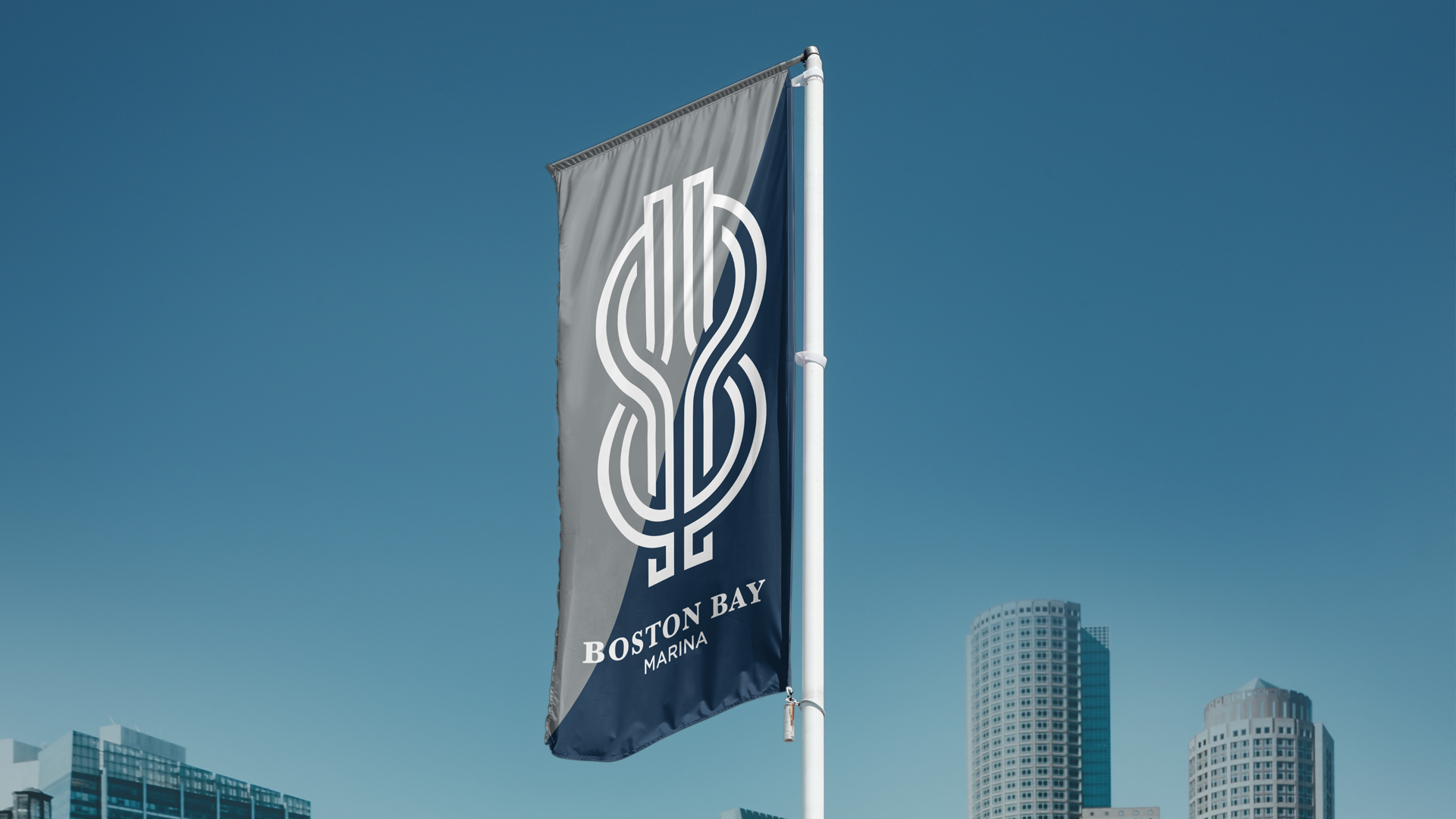
We have designed a multi-functional logo that captures the essence of a working marina. The square reef knot is used to join two ropes, symbolizing the boats that dock at the Boston Bay Marina.
Using this knot as a starting point, we developed a reef knot logo that contains two B’s back to back representing “Boston Bay”. Alongside the clean and bold font, this logo brings together nautical heritage and modern clean lines.
SERVICES: Brand Strategy // Branding // Logo Design
ASSETS: Logo Design // Branding Guide //
Design Process
Starting at the harbor was the best place to understand the needs of Boston Bay Marina. From the moment you arrive at the water’s edge, you can’t help but notice the rope connecting boats to buoys and docks. Rope is used on every vessel and it seemed like the best place to find an icon that would not only represent Boston Bay but the soul of a working marina.
Knots are important in the day-to-day of sailors and this is why the square reef knot and back-to-back B’s felt so right for the brand.
We're very proud of this smart and functional logo