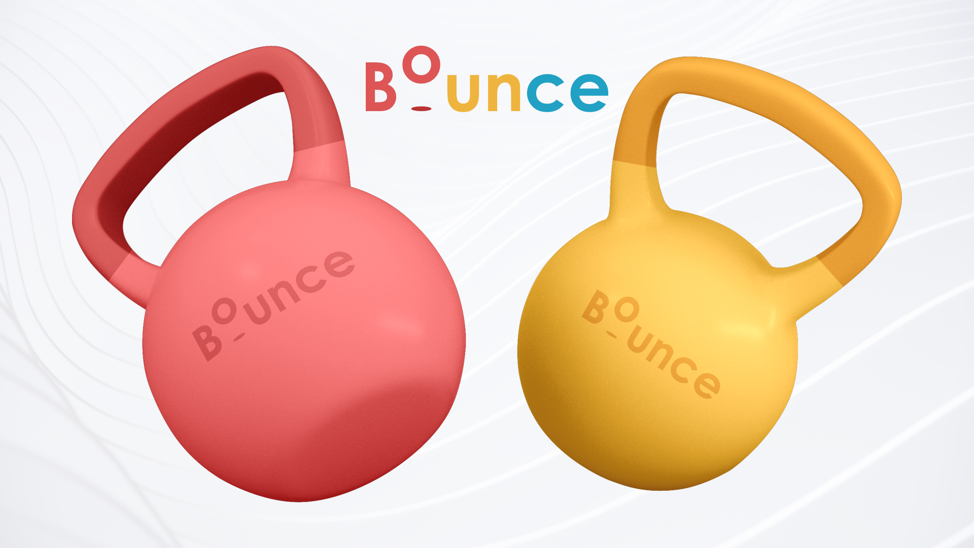
Bounce Rubber Fitness Equipment is a safe and good-looking alternative to other ugly fitness equipment brands.
Bounce believes that your motivation is directly affected by your environment. Maybe that’s why people lose motivation, they don’t want to interact with their ugly grey uninspiring equipment anymore.
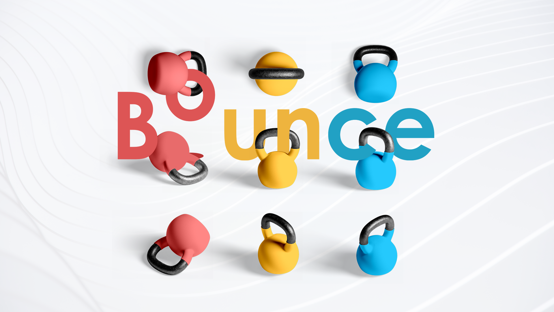
A creative and fun logo is required to demonstrate the brand voice of bounce.
solution:
With a pre-determined color palette, Bounce required a logo that represented their bright fun product line.
Bounces’ USP is that they are home-safe weights covered in thick protective rubber. With this in mind, we developed a logo that illustrated the USP and brand name.
SERVICES: Branding // Logo Design
Design Process
Bounce, it’s in the name and that’s what we designed.
We aimed to make the letters look like they were in motion. The O and its shadow make the letter look like it has hit the bottom plane and is bouncing upward.
I am really pleased that we represented bounce in such a creative and fun way.