THE TINY CARPENTER
Brand Strategy // Branding // Clothing Design // Logo Design // Packaging Design // Website Design

brief:
The Tiny Carpenter is a carpentry and wooden projects company that supplies children with age-appropriate tools in order to teach them new skills and develop a love for building and creativity.
Children as consumers are motivated to influence purchases, however, the key paying customer is always parents or grandparents. With this in mind, the product speaks directly to the child while the brand must look and feel like something a parent would want to bring into their home.
The brand must be simple and clean while feeling authentic and handmade. The brand must also work across multiple mediums. Iconography is key when building child-focused brands.
solution:
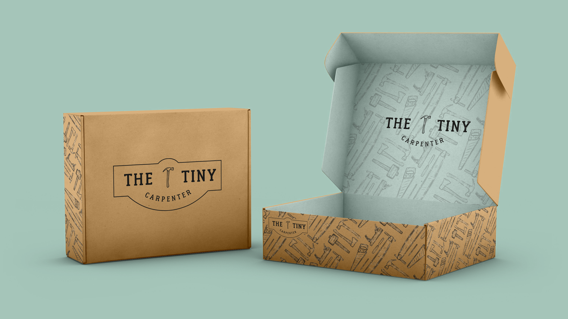
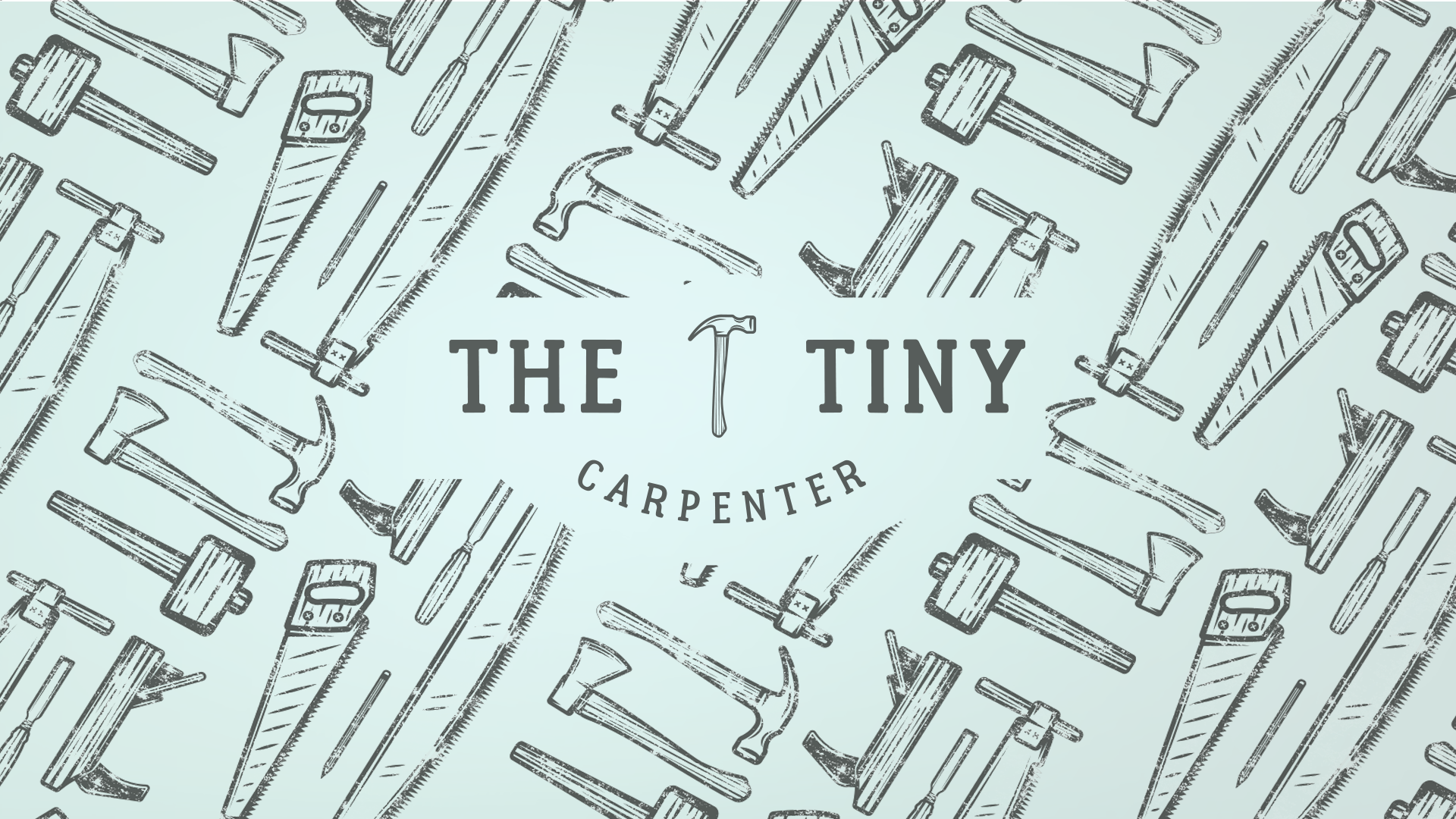
In order to follow the handmade styling required by the brief, we explored a classic stamping aesthetic and vintage stamp font.
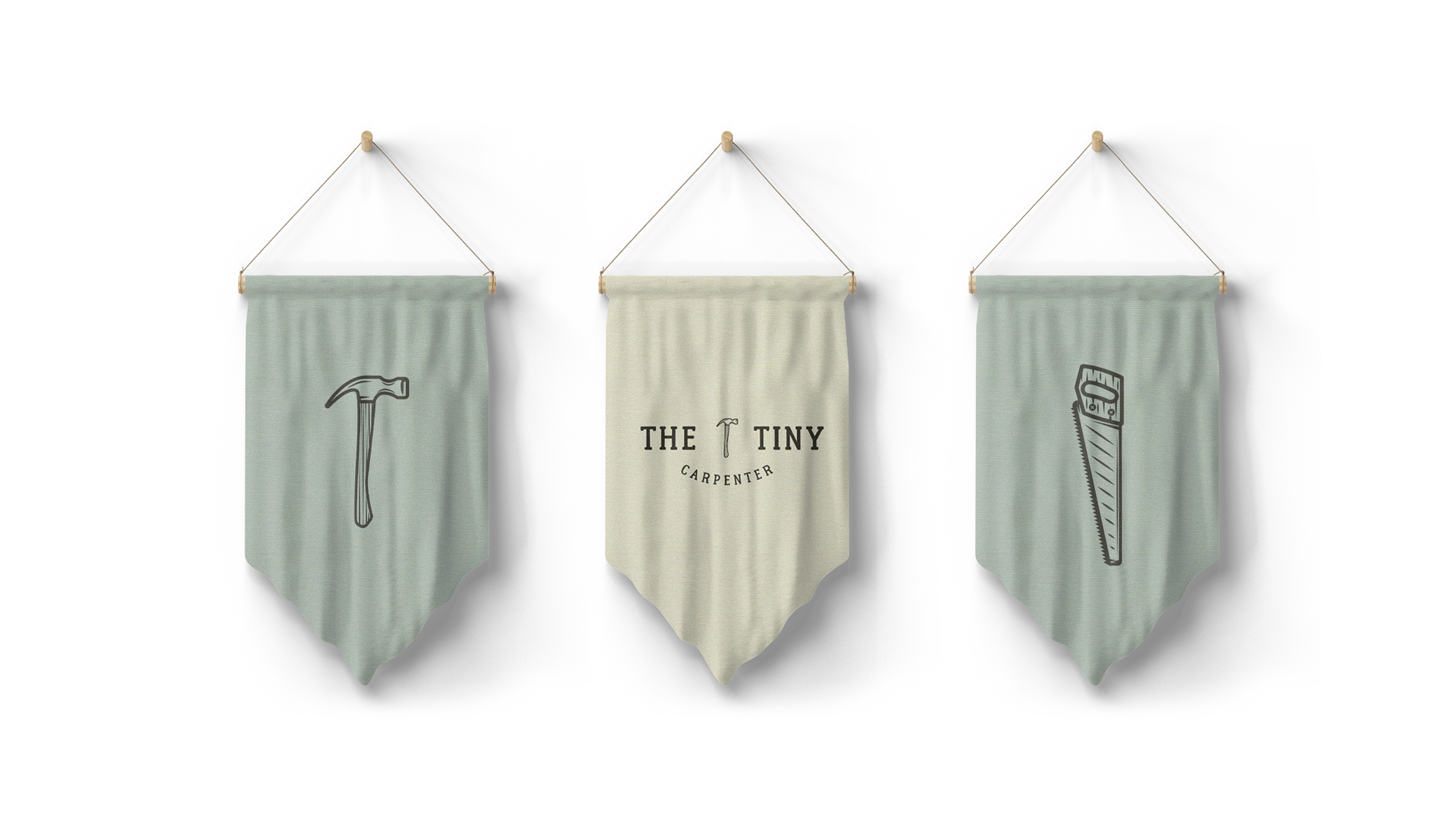
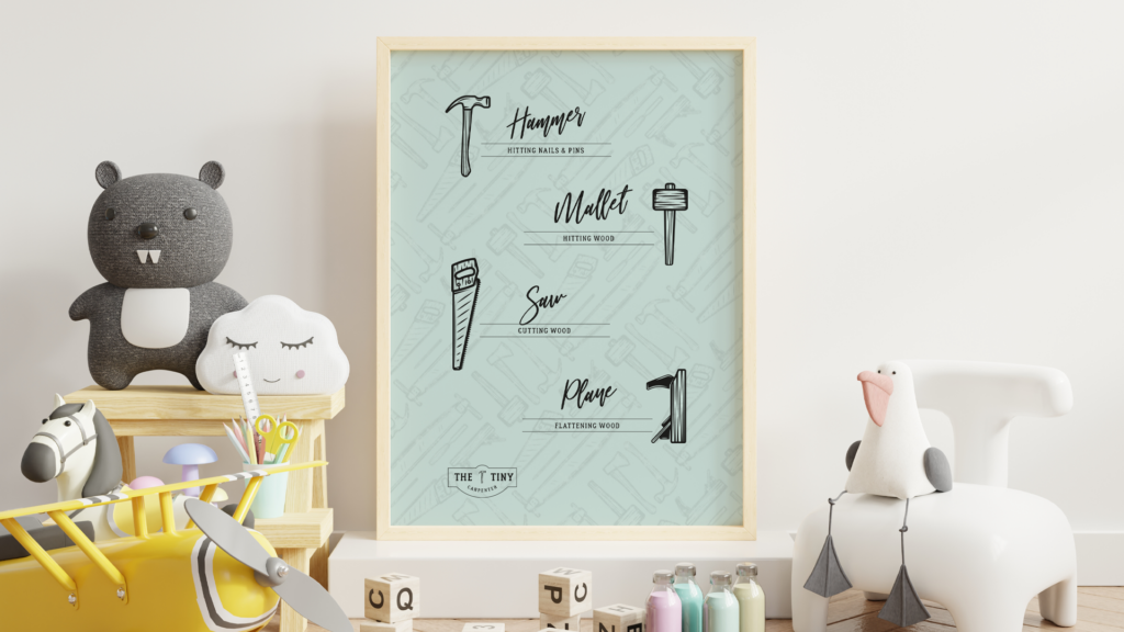
Iconography was also a large part of the brief, using a hammer as one of the most recognizable tools of a carpenter was key in developing simple iconography. Using the stamp style we also created various other tools that can be found in Tiny Carpenter Tool kits.
SERVICES: Brand Strategy // Branding // Clothing Design // Logo Design // Packaging Design // Website Design

DESIGN HISTORY
Stamps and typeset fonts were used in tooling manufacture before the digital age. Replicating this style would not have done the brand justice, however, using this style to build a modern clean brand created the perfect mix of tradition meets modernism.
Looking to the past enabled us to create a clean modern logo that stood apart from the crowd in a modern setting.

The logos and overall brand really appeal to grandparents and parents as a cool item, while the fun features like the patterns and miniature tools really appeal to the children.
Founder - The Tiny Carpenter
