UPPER VALLEY RUGBY CLUB
Brand Strategy // Branding // Clothing Design // Logo Design // Sports Marketing

brief:
Upper Valley Rugby Club has been operating since 2014 offering rugby to men and women throughout Vermont & New Hampshire. In 2019 UVRFC was accepted as a charity and aimed to make themselves feel more official by re-branding their club logos.
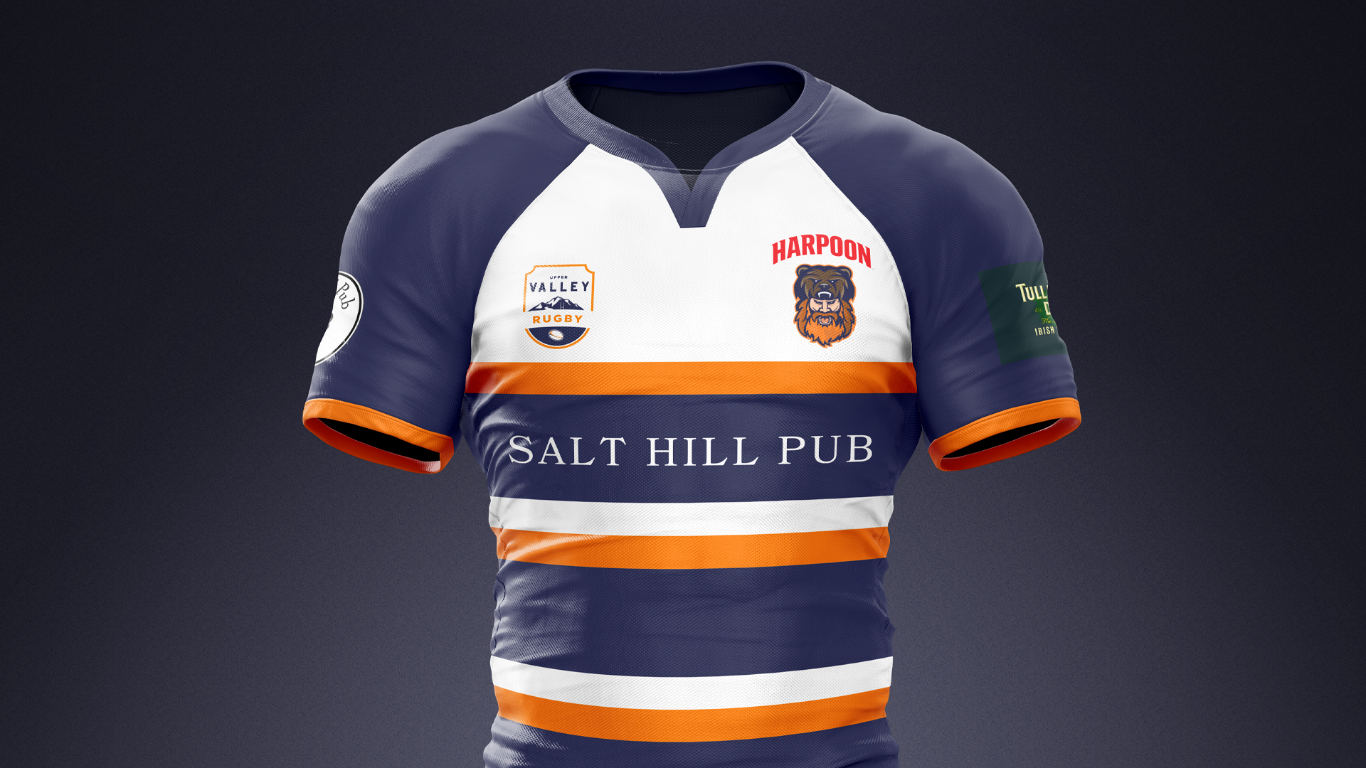
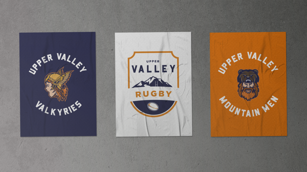
Overall club logo, Men’s Team Logo, and Women’s team logos all needed to be updated. The overall club logo must have a badge feel to echo the tradition of rugby while symbolizing the local valley. The Mountain Men & Valkyries are sub-brands under the overall club and must link to the club but can be free to explore a fun twist.
solution:
Using the club colors and names the logos needed to work together, yet be simple for easy application such as embroidery.
The Upper Valley club logo designed like a traditional badge uses bold fonts and mountain iconography in order to symbolize the Upper Valley region.
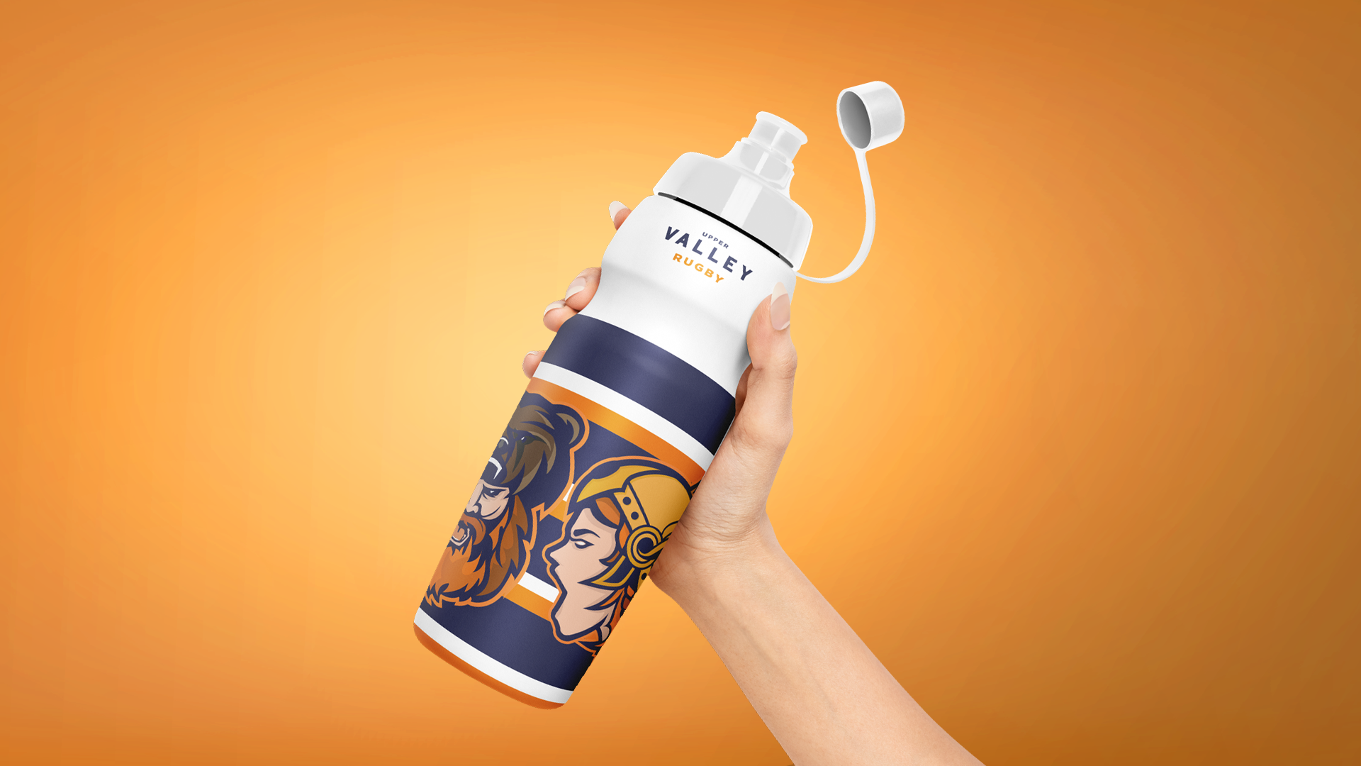
The Mountain Men and Valkyries logos take inspiration from professional sports teams, examples can be found in the NHL and MLR. Designing both together enabled for a cohesive style while telling different stories of different characters.
Leaning into the colours of the club, blue and orange the characters were naturally redheads with a Viking feel to them.
SERVICES: Brand Strategy // Branding // Clothing Design // Logo Design // Sports Marketing

Design Considerations
In order to keep the logo simple for embroidery, it is key to limit the color palette. All three logos work well alongside each other and require minimal manipulation in order to be manufactured for various products.

The logos are by far the best in the league, we are proud to wear them on our chest.
Brian Frampton - President