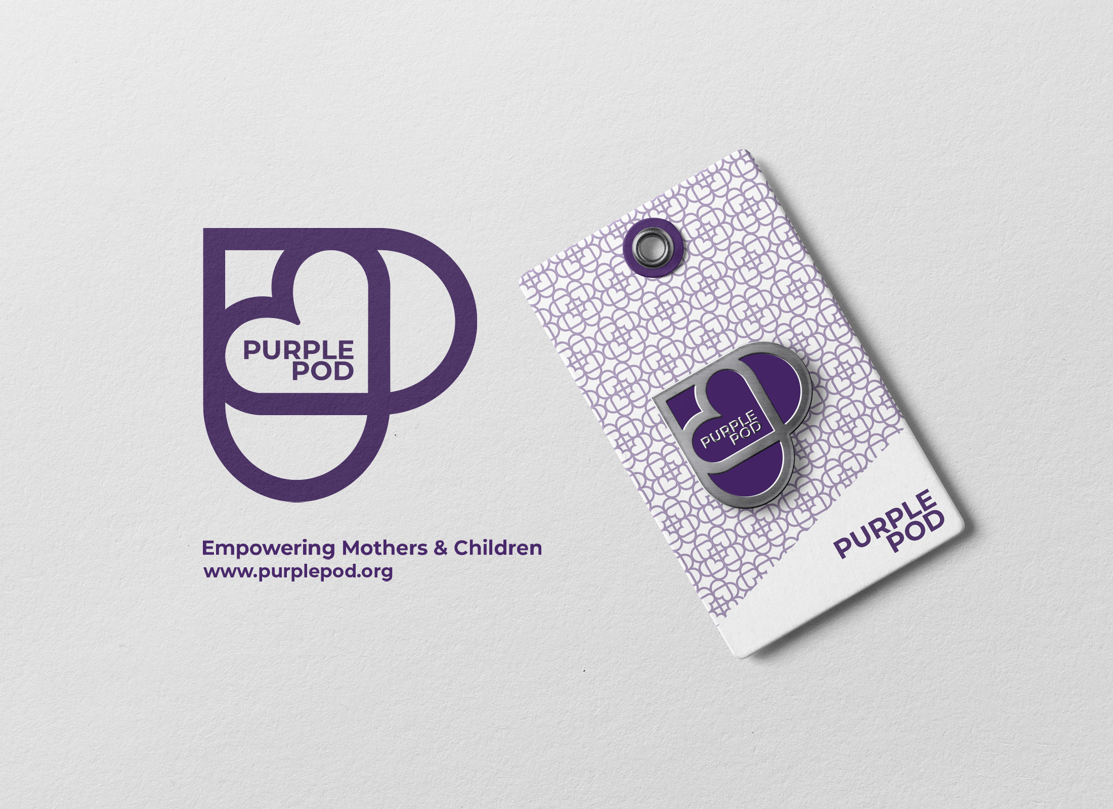
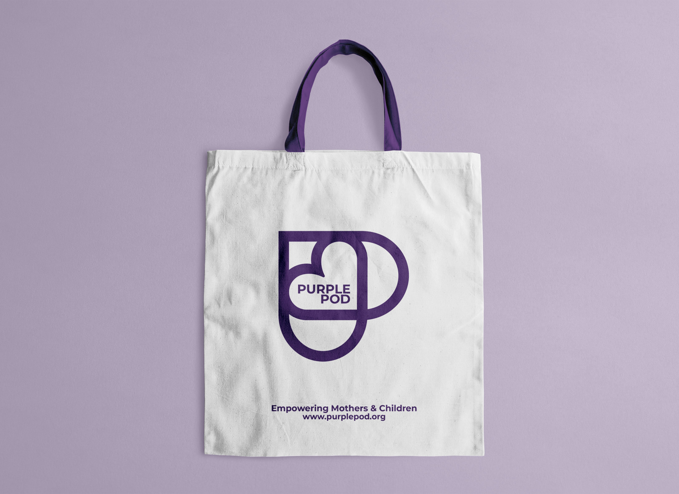
Purple Pod is a medical initiative that assists mothers in recovery from substance abuse. We were was asked to create a simple and discrete logo that could be easily recognized and turned into an enamel pin.
Mothers in recovery face many challenges, one of which is trust in medical professionals who are often not trained to deal with their specific needs. The Purple Pod badge is given to doctors who have been specially trained to assist mothers in recovery and by wearing a pin are easily recognizable to those that seek help in relation to substance abuse and parenting.
solution:
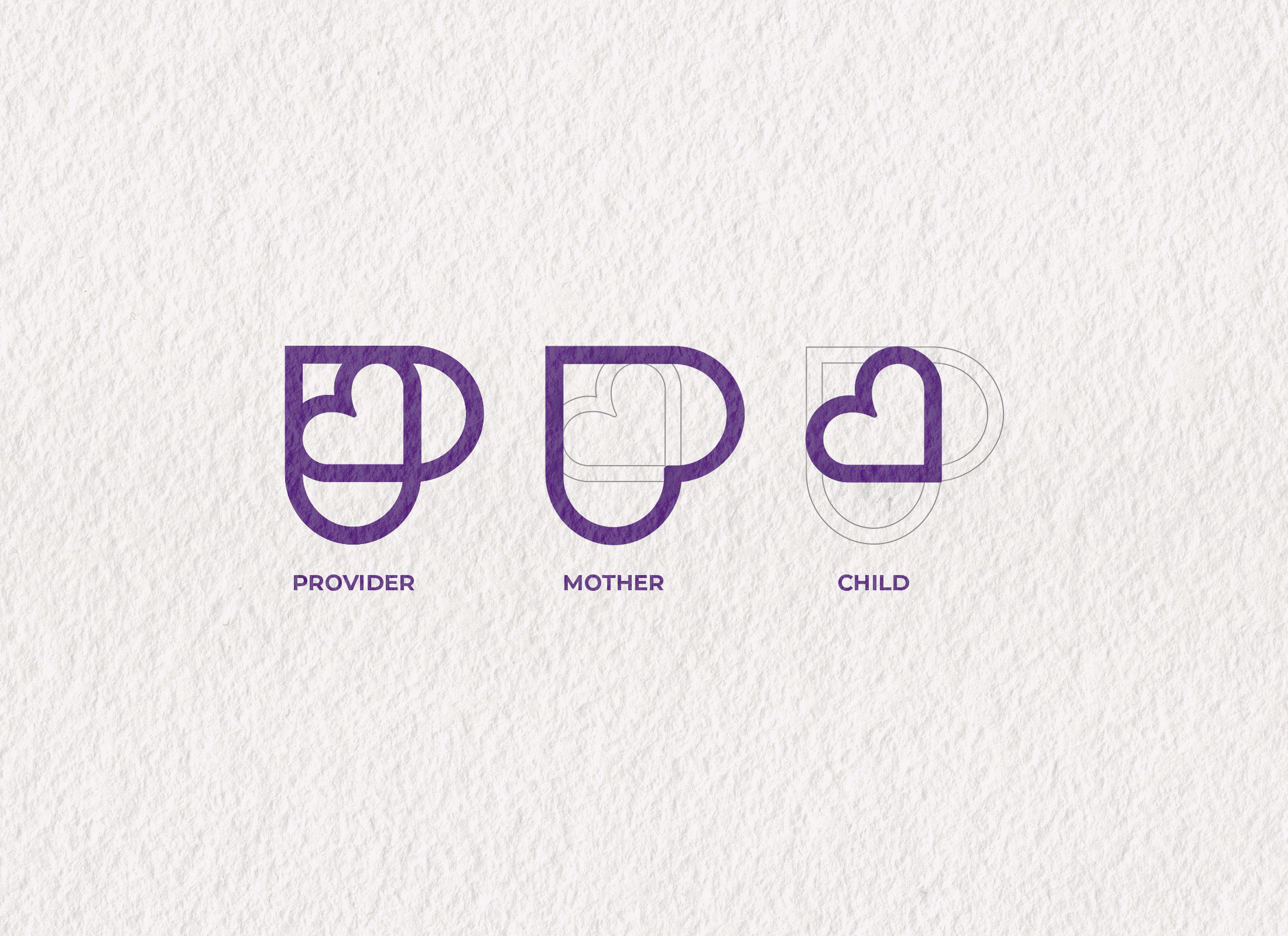
When starting a logo that requires such tact and subtly, it is important to consider symbology. In the case of the purple pod there are three entities that are important to consider; the child, the mother and the healthcare providers.
We wanted to emulate how the three entities come together to create a harmonious relationship that benefits everyone.
Using this concept we focused on a subtle letter P, intertwined with a large heart representing the mother and a small heart within it that represented the child.
SERVICES: Brand Strategy // Branding // Logo Design
ASSETS: Logo // Branding
The Center for Addiction Recovery in Pregnancy and Parenting
The Center for Addiction Recovery in Pregnancy and Parenting (CARPP) is a multidisciplinary network of experienced clinicians and researchers working together to support recovery from addiction for women who are pregnant and parenting, and to promote healthy growth and development in their children.
CARPP’s work informs clinical services, research, education, and advocacy in the treatment of pregnant and parenting women and their young children who are impacted by substance use disorders.
I am really happy to help create something that could impact the lives of others.