Rider Motorcycles is a startup with one mission, to make stylish clothing for motorcycle riders.
Motorcycle brands often focus on the Hell’s Angels vibe. Rider recognizes that just because you love motorcycles doesn’t mean you want a skull on everything you own.
With this in mind, it is important that the Rider logo demonstrates that it’s a motorcycle brand, without using any cheesy “Biker” symbols.
Rider aims to build a brand for bikers, but also to note that you don’t have to dress like a killer, in order to look, killer.
solution:
Creating a brand that looks and feels like a motorcycle apparel company, without using any dark or edgy material is not easily achieved.
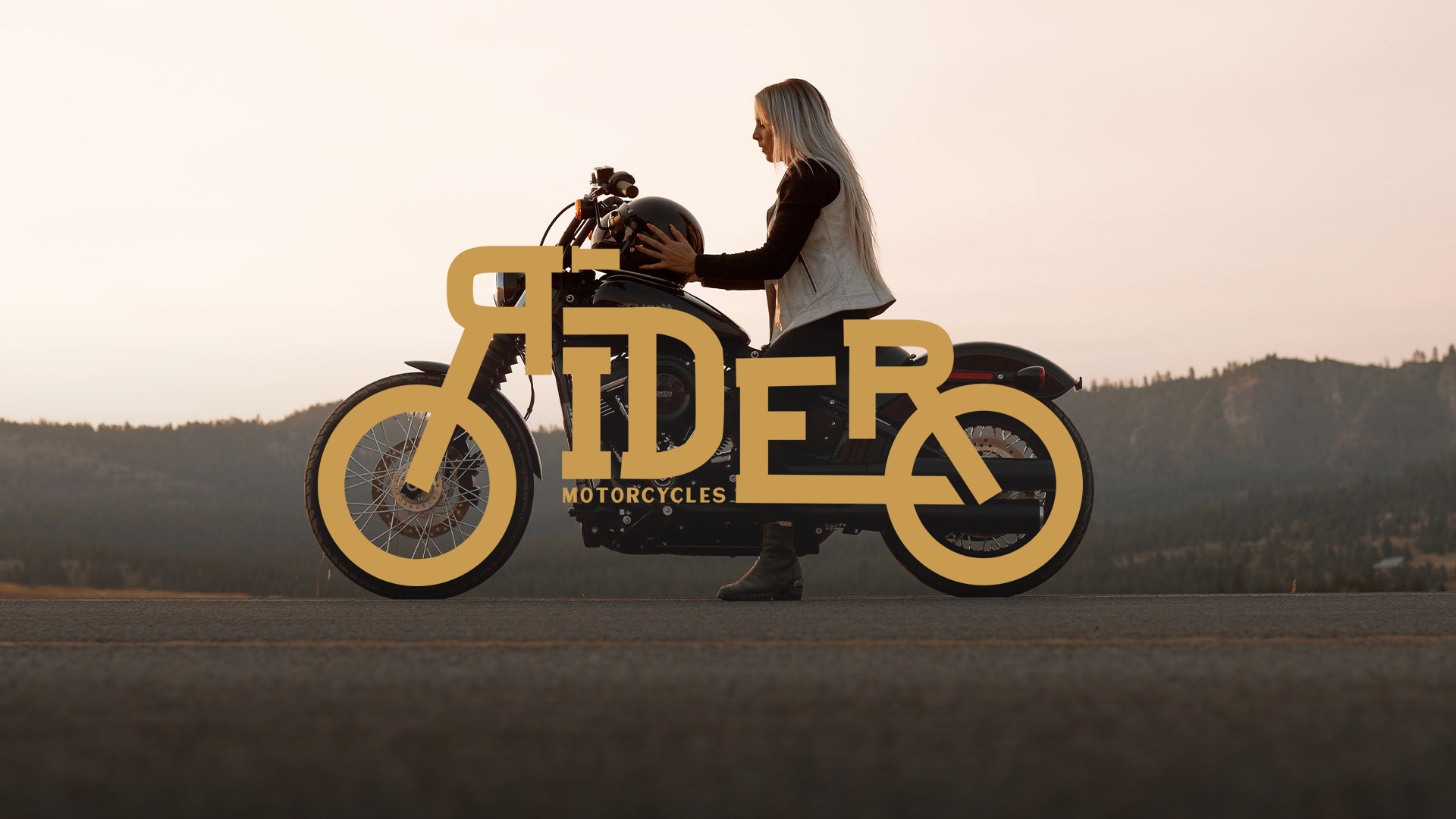
We started with the thing that connects all riders, from Cafe Cruisers to Hell’s Angels; the motorcycle. Using a clean simple font to form Rider into the shape of a motorcycle not only demonstrates a cool clean vibe, but it also conveys that Rider is a motorcycle brand.
The gold color gives a sense of tradition while working well alongside black and brown leathers.
Typography is a powerful medium when used creatively, not only can it be clean and legible but also paint a picture. It all started with the thing that connects every rider, the motorcycle.
When the concept for this logo began, we struggled to build the outline of a classic motorcycle. We solved this by turning to local motorcycle designers and engineers to assist with the dimensions of a classic motorcycle.
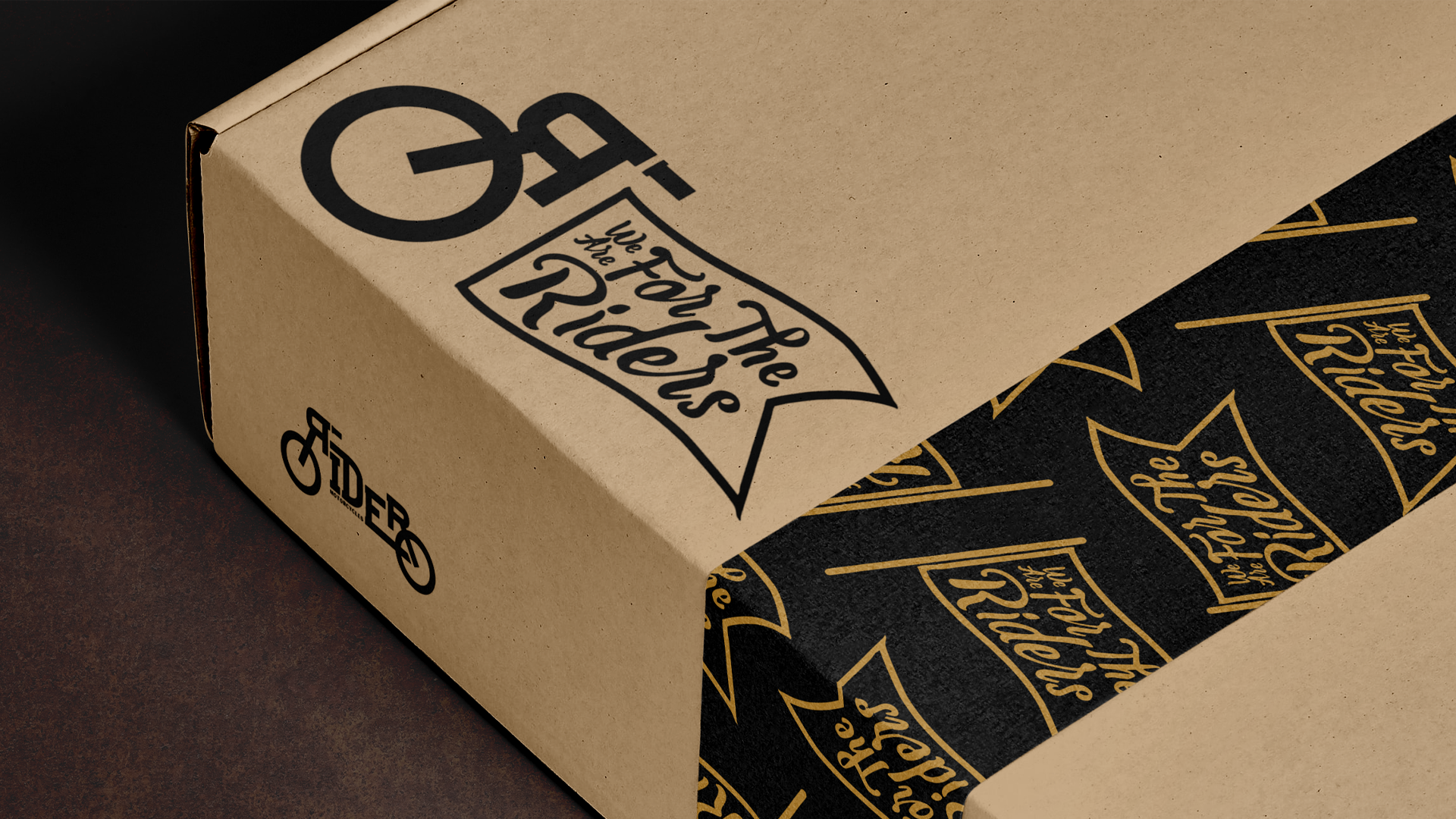
We couldn't have imagined such a creative logo. Rider is not only a cool logo, but something we are proud to wear and sell.