Shute Farm has produced milk in Vermont from Holstein cows since the turn of the 20th century. Throughout the years they have built a thriving B2B business with a rich culture, however, they are yet to have an official logo or brand.
Now looking to take on the direct-to-consumer production of dairy goods, Shutes need a brand that demonstrates 100 years of farming history, while retaining a ‘fresh’ look that consumers desire when purchasing short-life consumable products.
solution:
The Shute’s logo is entirely hand-drawn, it takes inspiration from classic logos of the early 1900’s such as Kellog’s or Campbell’s. These heritage food brands carry their history with grace yet retain brand loyalty with modern consumers.
Focusing on a clean hand-drawn script font allowed for product versatility and future-proofing while demonstrating a deep and rich brand that feels as old as the Schute Farm itself.
The farm manager is passionate about two things, Holstein cows & International Tractors. In order to emulate a historically accurate farm aesthetic throughout the design, the colors and forms are directly inspired by brands with farming heritage.
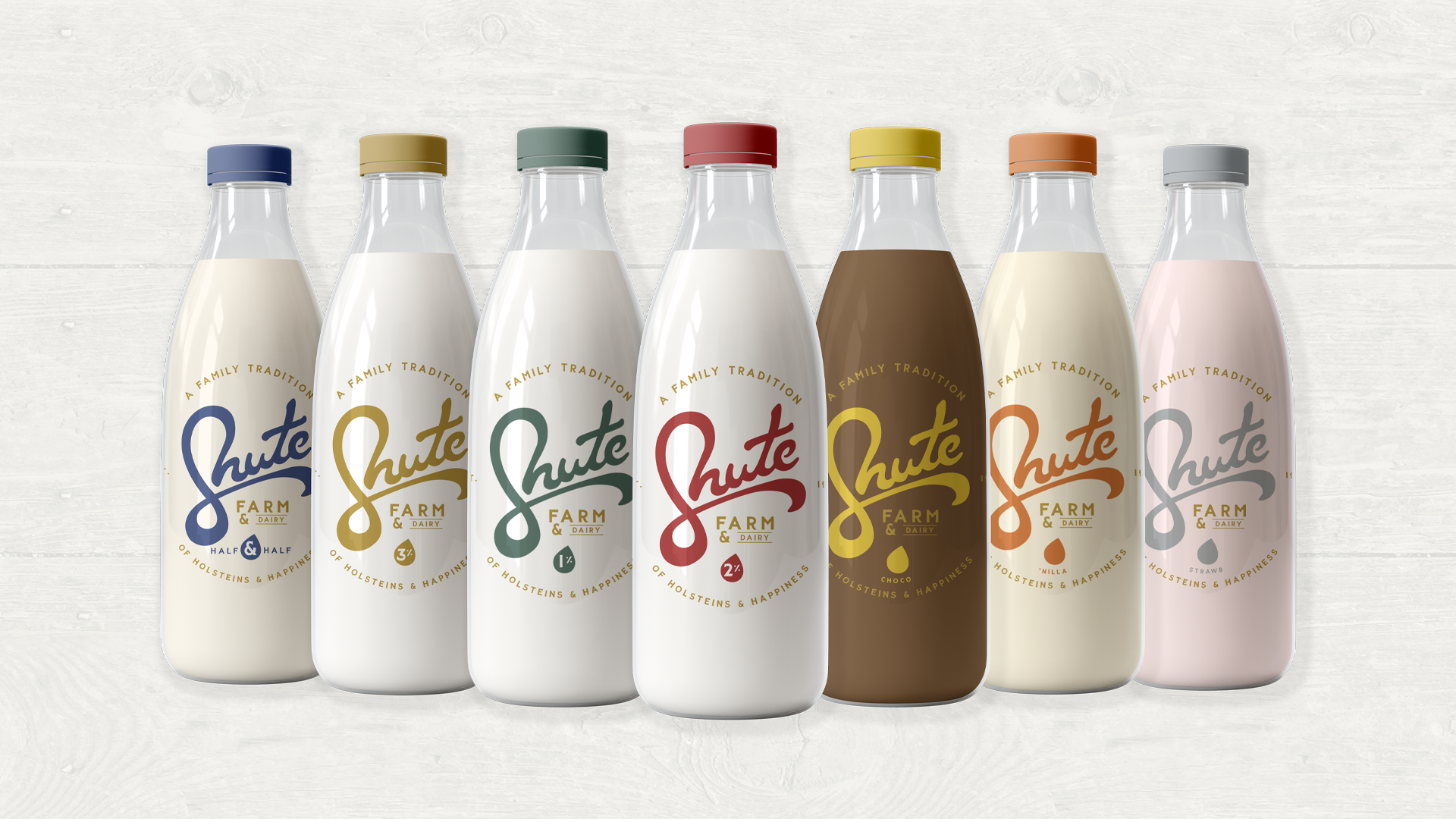
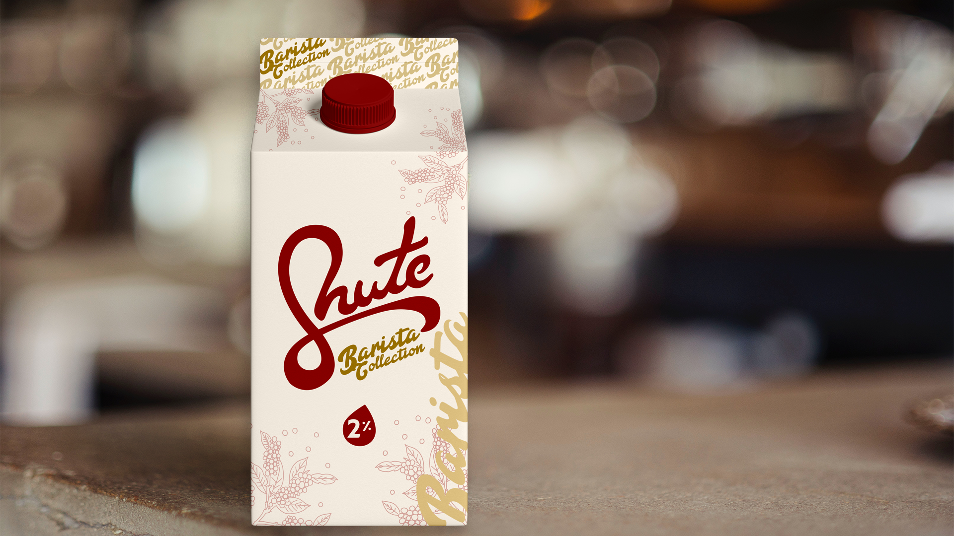
ASSETS: Logo // Merchandise // Full Packaging Design Concept //
DESIGN PROCESS:
In order to build a historically accurate brand, it is important to replicate the processes used in those times.
When designing the Shute’s logo we worked entirely by hand, sketching and re-sketching using layouts and light-boxes. No typesets or software assistance was used until the logo was fully completed by hand.
Heritage and research are key when building a heritage brand. Using a color palette found in a 1930’s International Tractor brand book not only ties the design to the correct era but makes a connection to the Shute love of International Tractors.
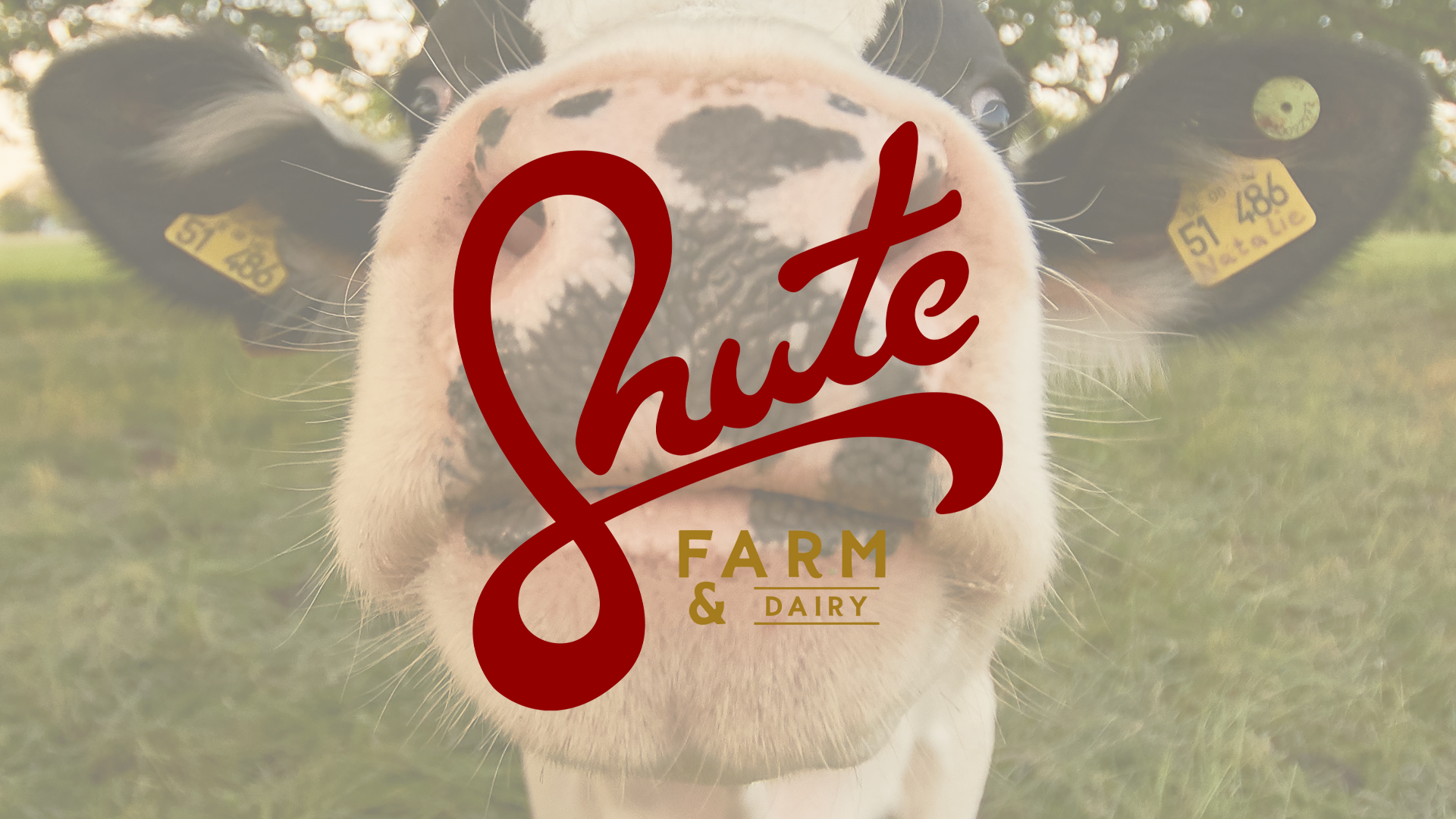
The milk drop and cow tail are small details that were added to the design in order to subtly nod to the cows that are at the heart of the business without using obvious iconography. In the turn of the ‘S’ a milk drop is created, and as the swoosh continues the basic shape of a cow’s tail is emulated. These small touches are the details that link a clean simple logo to it’s product and heritage.